 小肚肚肚肚肚哦
小肚带您 Tailwind CSS 快速入门
Tailwind CSS是一个功能类优先的CSS框架,帮助开发者快速开发 CSS,灵活可定制。鉴于官网的描述比较晦涩,新手上手比较难,有各种坑需要踩,实操性不强,本期就带大家了解一下这个 CSS 快速开发框架的使用以及一些常用的配置。
本文写给没时间查阅文档,但又想快速上手的开发者。本文涉及到的知识,覆盖了平时业务开发的大多数场景,可供参考查阅
开发环境:node16+ | VS Code
如果您已经掌握了 Tailwind 的基本原理,只想知道具体框架如何配置,可以直接跳转到下面对应章节查阅。
1. VS Code 插件
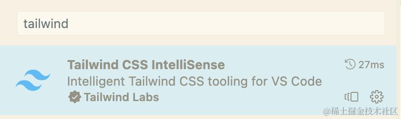
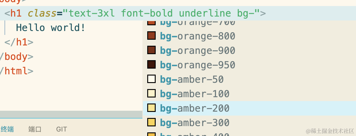
安装好后就可以有自动提示了:
插件还可以高亮错误. 预览内置css样式. 设置语言环境等,推荐 VS Code 用户使用。
2. Tailwind CLI
新建一个文件夹,在文件夹根目录下:
yarn add --dev tailwindcss
npx tailwindcss init
我们会看到一个配置文件 tailwind.config.js 在根目录下生成,我们添加要检索的文件:
/** @type {import('tailwindcss').Config} */
module.exports = {
  content: ['./index.html'],
  theme: {
    extend: {},
  },
  plugins: [],
}
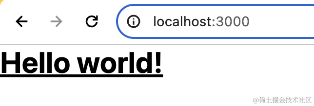
这样,Tailwind 就只会检测 index.html 中是否使用了 tailwindcss,并声称最小 css 集合。我们写一下这个 index.html:
<!doctype html>
<html>
<head>
  <title>hello</title>
  <meta charset="UTF-8">
  <meta name="viewport" content="width=device-width, initial-scale=1.0">
  <link href="/dist/output.css" rel="stylesheet">
</head>
<body>
  <h1 class="text-3xl font-bold underline">
    Hello world!
  </h1>
  <button class="underline bg-violet-500 hover:bg-violet-600 active:bg-violet-700 focus:outline-none focus:ring focus:ring-violet-300 ...">
    Save changes
  </button>
</body>
</html>
然后在 src 目录下写一个 input.css 文件:
@tailwind base;  // 引入基础样式,比如 body的margin. 样式继承规则等
@tailwind components;  // 引入常用的组件样式,一般在其他前端框架中使用
@tailwind utilities; // 工具样式,比如下划线. 字体颜色等
执行 cli:
npx tailwindcss -i ./src/input.css -o ./dist/output.css --watch --config ./tailwind.config.js
这里的 --config ./tailwind.config.js 可以不写,默认会检索根目录下的同名文件。
这里有一个坑,如下图
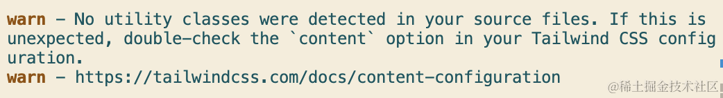
如果你执行指令后出现 cli,有可能是输入输出的文件路径不对,也有可能是目标配置文件不存在,还有可能是你配置文件检测的 content 不存在或没有使用 tailwincss。我第一次出现这个错误,是误把 --config 写成了 --content...
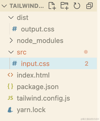
到此为止,就生成一个输出文件,工程目录如下:
由于 tailwindcss 只能运行在服务器环境,我们这里就搭建一个开发服务器来说明问题:
yarn add --dev http-server

npx http-server
服务跑起来:
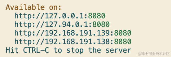
我们打开 8080 端口查看:
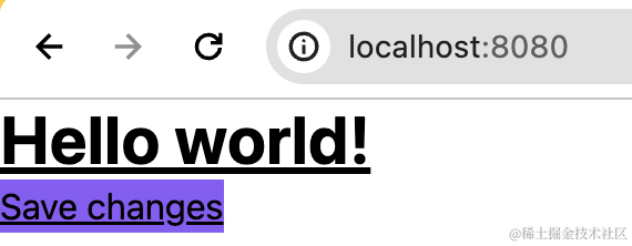
样式已经上去了。
3. 与 postcss 和 sass 结合使用
postcss 用于格式化样式,使的样式更加规范统一,不会样式污染。我们使用一个依赖 postcss 的 autoprefixer 为样式自动增加前缀,执行如下指令:
yarn add --dev postcss autoprefixer postcss-nesting postcss-import
后两个依赖是实现级联 css 的解析 和 解析 @import 语句的。我们在根目录下新建文件 postcss.config.js,以插件的形式引入依赖:
module.exports = {
  plugins: {
    'postcss-import': {},
    'tailwindcss/nesting': 'postcss-nesting',
    tailwindcss: {},
    autoprefixer: {},
  }
}
将 input.css 改为 input.scss,并修改文件:
@tailwind base;
@tailwind components;
@tailwind utilities;

body {
  h1 {
    font-size: 64px !important;
  }
}

@media (min-resolution: 2dppx) {
  .image {
    background-image: url(image@2x.png);
  }
}
然后执行 cli 指令,指明这个配置文件:
npx tailwindcss -i ./src/input.scss -o ./dist/output.css --watch --postcss postcss.config.js
我们看看输出的 output.css:
body h1 {
  font-size: 64px !important;
}

@media (-webkit-min-device-pixel-ratio: 2), (min-resolution: 2dppx) {
  .image {
    background-image: url(image@2x.png);
  }
}
可以看到已经解析为普通的 css,并添加了兼容性前缀和自动计算兼容性单位。
4. 内置样式类速查表
如果不想看速查,直接调到后边框架使用即可
有一个初步认识后,我们这里来分类总结一下 tailwindcss 的常用样式类,如果想要看全部的样式,参见:tailwind。
(1. 预检样式
@tailwind base;
他引入后,自动设置默认边距是0. 所有的标题标签的字体大小和权重继承他的包含块. 列表样式清除. 图片. iframe等多媒体标签自动为块级. 图片视频自动被限制为最大父级宽度. 重写默认边框样式等。
当然你也可以扩展预检范围:
@tailwind base;
@layer base { h1 { @apply text-2xl; } }
预检样式表如下:https://unpkg.com/tailwindcss@3.3.5/src/css/preflight.css
(2. 布局
纵横比:
| Class | Properties |
|---|---|
| aspect-auto | aspect-ratio: auto; |
| aspect-square | aspect-ratio: 1 / 1; |
| aspect-video | aspect-ratio: 16 / 9; |
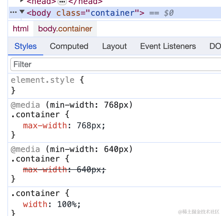
响应式容器:
| Class | Breakpoint | Properties |
|---|---|---|
| container | None | width: 100%; |
| sm (640px) | max-width: 640px; | |
| md (768px) | max-width: 768px; | |
| lg (1024px) | max-width: 1024px; | |
| xl (1280px) | max-width: 1280px; | |
| 2xl (1536px) | max-width: 1536px; |
使用举例:
(3. 列布局
| Class | Properties | note |
|---|---|---|
columns-{num} | columns: 1; | num可取: [1-12] |
| columns-auto | columns: auto; | |
| columns-3xs | columns: 16rem; /* 256px */ | |
| columns-2xs | columns: 18rem; /* 288px */ | |
| columns-xs | columns: 20rem; /* 320px */ | |
| columns-sm | columns: 24rem; /* 384px */ | |
| columns-md | columns: 28rem; /* 448px */ | |
| columns-lg | columns: 32rem; /* 512px */ | |
| columns-xl | columns: 36rem; /* 576px */ | |
columns-{num}xl | columns: 36rem 的 num 倍 | num可取: [2-7] |
文章最后我们会有一个实战说明
(4. 溢出处理
| Class | Properties |
|---|---|
| overflow-auto | overflow: auto; |
| overflow-hidden | overflow: hidden; |
| overflow-clip | overflow: clip; |
| overflow-visible | overflow: visible; |
| overflow-scroll | overflow: scroll; |
| overflow-x-auto | overflow-x: auto; |
| overflow-y-auto | overflow-y: auto; |
| overflow-x-hidden | overflow-x: hidden; |
| overflow-y-hidden | overflow-y: hidden; |
| overflow-x-clip | overflow-x: clip; |
| overflow-y-clip | overflow-y: clip; |
| overflow-x-visible | overflow-x: visible; |
| overflow-y-visible | overflow-y: visible; |
| overflow-x-scroll | overflow-x: scroll; |
| overflow-y-scroll | overflow-y: scroll; |
(5. 定位
| Class | Properties |
|---|---|
| static | position: static; |
| fixed | position: fixed; |
| absolute | position: absolute; |
| relative | position: relative; |
| sticky | position: sticky; |
(6. display
| Class | Properties |
|---|---|
| block | display: block; |
| inline-block | display: inline-block; |
| inline | display: inline; |
| flex | display: flex; |
| ... |
flex 对其方式:
| justify-center | justify-content: center; |
|---|---|
| justify-between | justify-content: space-between; |
| justify-around | justify-content: space-around; |
| items-start | align-items: flex-start; |
| items-end | align-items: flex-end; |
| items-center | align-items: center; |
(7. 边距
| Class | Properties |
|---|---|
| p-0 | padding: 0px; |
| px-0 | padding-left: 0px; padding-right: 0px; |
| py-0 | padding-top: 0px; padding-bottom: 0px; |
| ... |
| Class | Properties |
|---|---|
| m-0 | margin: 0px; |
| mx-0 | margin-left: 0px; margin-right: 0px; |
| my-0 | margin-top: 0px; margin-bottom: 0px; |
| ... |
如果设置单个边距,可使用缩写:pl-1:padding-left: 1px,以此类推
(8. 文本类
| Class | Properties |
|---|---|
| truncate | overflow: hidden; text-overflow: ellipsis; white-space: nowrap; |
| text-ellipsis | text-overflow: ellipsis; |
| text-clip | text-overflow: clip; |
| ... |
(9. 边框
| Class | Properties |
|---|---|
| border-0 | border-width: 0px; |
| border-2 | border-width: 2px; |
| border-4 | border-width: 4px; |
| border-8 | border-width: 8px; |
| border | border-width: 1px; |
| rounded-md | border-radius: 0.375rem |
| ... |
(10. 动画
| Class | Properties |
|---|---|
| animate-none | animation: none; |
| animate-spin | animation: spin 1s linear infinite; @keyframes spin { from { transform: rotate(0deg); } to { transform: rotate(360deg); } } |
| animate-ping | animation: ping 1s cubic-bezier(0, 0, 0.2, 1) infinite; @keyframes ping { 75%, 100% { transform: scale(2); opacity: 0; } } |
| animate-pulse | animation: pulse 2s cubic-bezier(0.4, 0, 0.6, 1) infinite; @keyframes pulse { 0%, 100% { opacity: 1; } 50% { opacity: .5; } } |
| animate-bounce | animation: bounce 1s infinite; @keyframes bounce { 0%, 100% { transform: translateY(-25%); animation-timing-function: cubic-bezier(0.8, 0, 1, 1); } 50% { transform: translateY(0); animation-timing-function: cubic-bezier(0, 0, 0.2, 1); } } |
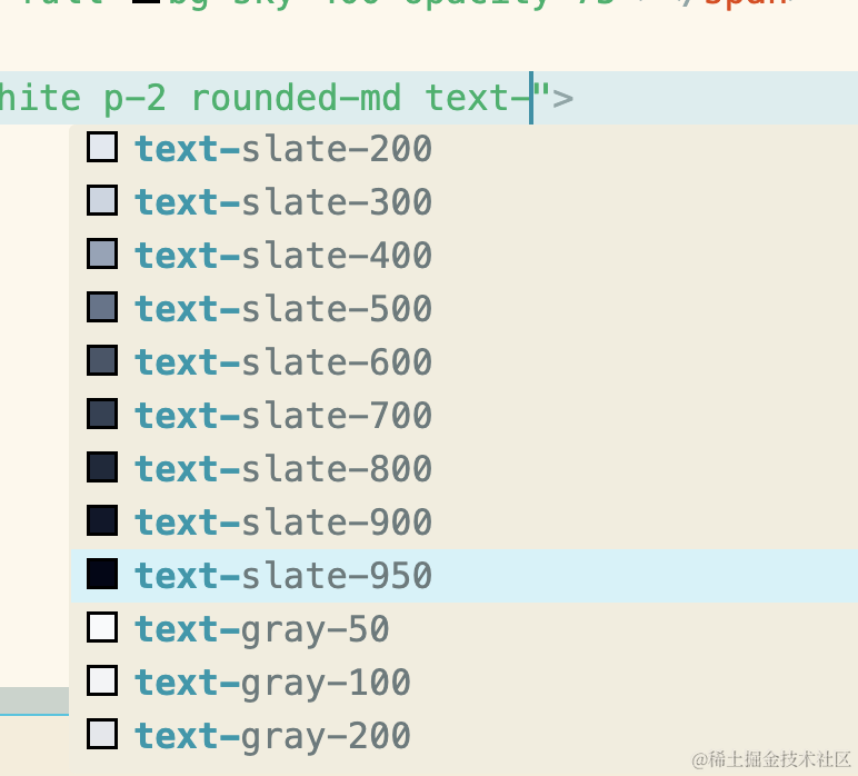
(11. 颜色
- bg 开头 (css 中 theme(textColor.) 或 theme(colors.) 开头) 表示背景色,通过插件可以自己选择:
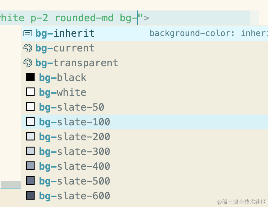
- text (css 中 theme(textColor.) 或 theme(colors.)) 开头表示文字颜色:
(12. 事件
- snap 或 scroll 开头:监听滚动事件,参考 滚动
- hover: 开头:监听鼠标悬浮事件
- active: 和 focus: 开头:捕获激活的和聚焦的元素
- first: 捕获第一个元素
- odd: 和 even: 捕获奇偶元素
- 还可以捕获伪元素:after: 等:伪元素
(插件
排版插件:
yarn add --dev @tailwindcss/typography
添加配置文件:
plugins: [ require('@tailwindcss/typography') ],
使用:
<article class="prose lg:prose-xl">
表单插件:
yarn add --dev @tailwindcss/forms
配置:
plugins: [
  require('@tailwindcss/forms'),
  // ...
],
使用:
<input type="email" class="form-input px-4 py-3 rounded-full">

<select class="form-select px-4 py-3 rounded-full">
<!-- ... -->
</select>
可用样式:
| 元素 | class |
|---|---|
input | form-input |
textarea | form-textarea |
select | form-select |
select[multiple] | form-multiselect |
[type='checkbox'] | form-checkbox |
[type='radio'] | form-radio |
5. 自定义样式
在配置文件中可以这样写:
theme: {
    extend: {
      spacing: {
        '8xl': '96rem',
        '9xl': '128rem',
      },
    },
    screens: {
        'sm': '640px', // => @media (min-width: 640px)
        ...
    },
    colors: {
      'text-blue': '#4848ff'
    }
  },
这样就可以使用了。
在 css 中使用:
color: theme('colors.text-blue');
max-width: theme('spacing.8xl');
@media (min-width: theme('screens.sm')) {}
在 html 中使用:
<p class="text-text-blue">
<div class="mb-8xl"> <!-- mb 是 margin bottom -->
<div class="sm:flex"> <!-- 这个元素在屏幕宽度大于等于 'md' 时将使用 flex 布局 -->
类名中,颜色会自动加入 text 前缀。由于类名没有规则,不太好记,推荐新手使用 css 来引入自己的自定义主题
6. Nextjs 中使用
执行命令行:
npx create-next-app@latest
可选择项选择如下:
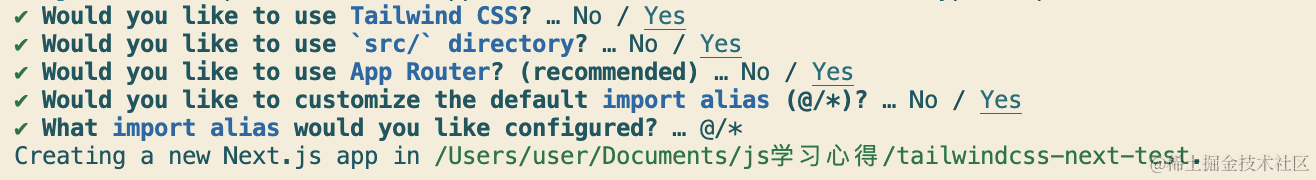
App router 是另一种路由方式,每一个文件夹是一个页面,入口文件都是 page.tsx,可参考:https://nextjs.org/docs/app/building-your-application/routing/route-groups
工程目录生成后,项目会自动在根目录下建立 postcss.config.js 和 tailwind.config.js。
项目目录如下:
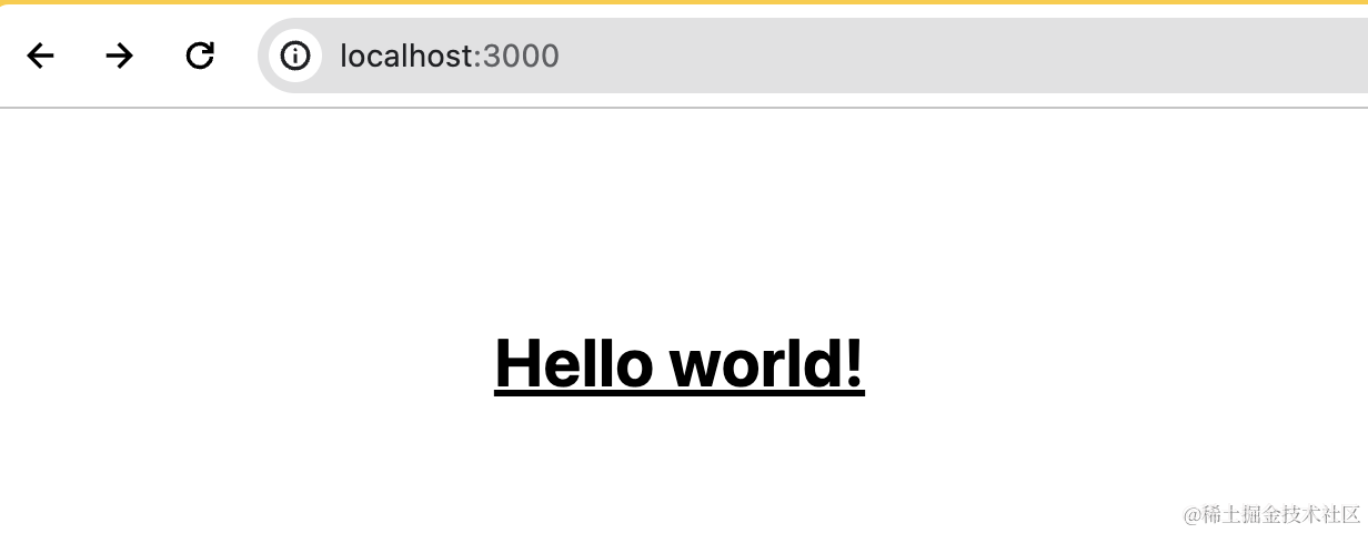
我们配置入口 page.tsx:
export default function Home() {
  return (
    <main className="flex min-h-screen flex-col items-center justify-between p-24">
      <h1 className="text-3xl font-bold underline">
        Hello world!
      </h1>
    </main>
  )
}
页面上查看:
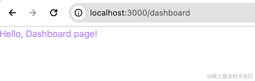
在 css module 中使用
我们在 dashboard/index.module.css 中写入:
.container {
  color: theme(textColor.purple.400);
}
在 dashboard/page.tsx 中引入:
import styles from './index.module.css';

export default function Page() {
  return <h1 className={`${styles['container']}`}>Hello, Dashboard page!</h1>
}
我们访问页面查看:
在 mdx 文件中使用
若要在 mdx 文件中使用,App Router 需要如下配置:
安装依赖:
yarn add @next/mdx @mdx-js/loader @mdx-js/react @types/mdx
在 src 目录下配置 mdx-components.tsx:
import type { MDXComponents } from 'mdx/types'

export function useMDXComponents(components: MDXComponents): MDXComponents {
  return {
    ...components,
  }
}
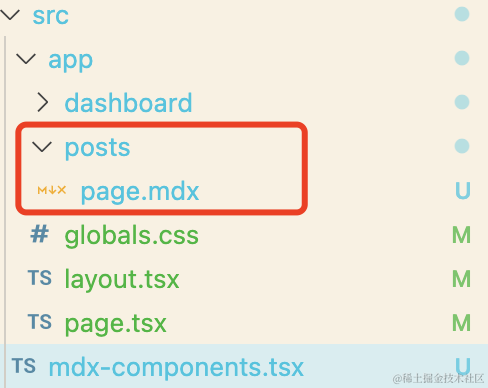
然后新建一个包含 mdx 文件的目录:
page.mdx 写道:
<div className="bg-blue-500 p-4">
  This is a styled div.
</div>

Hello Mdx
页面查看:
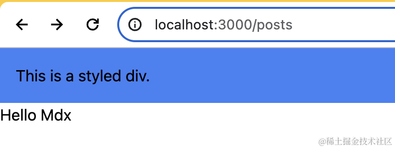
样式生效了!
7. vite 项目中使用
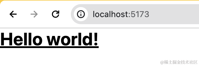
我们先通过 vite 创建一个 vue 项目:
npm create vite@latest my-project -- --template vue
然后进入工程根目录下,安装依赖和初始化配置:
yarn add --dev tailwindcss postcss autoprefixer
npx tailwindcss init -p
配置文件 tailwind.config.js 中写入你要拦截的使用了css资源的文件内容:
export default {
  content: [
    "./index.html",
    "./src/**/*.{vue,js,ts,jsx,tsx}",
  ],
  theme: {
    extend: {},
  },
  plugins: [],
}
在 style.css 中引入:
@tailwind base;
@tailwind components;
@tailwind utilities;
我们把 App.vue 中自带的所有样式清空,写下如下的测试代码:
// 文字粗体. 带下划线. 3xl大小
<h1 class="text-3xl font-bold underline"> Hello world! </h1>
运行服务,可以看到效果已经出来:
8. Nuxtjs 项目中使用
nuxtjs 推荐使用支持 vue3 的模块化方案 nuxi。我们先初始化项目:
npx nuxi init my-project
然后进入根目录下安装依赖:
yarn
npx nuxi module add @nuxtjs/tailwindcss
npx tailwindcss init
这里不需要手动修改 tailwin.config.js,使用默认值就可以,看来 nuxt 的集成度还挺高的。直接启动项目,修改 app.vue:
<template>
<h1 class="text-3xl font-bold underline">
  Hello world!
</h1>
</template>
查看效果:
9. 实战
(1. 切换主题
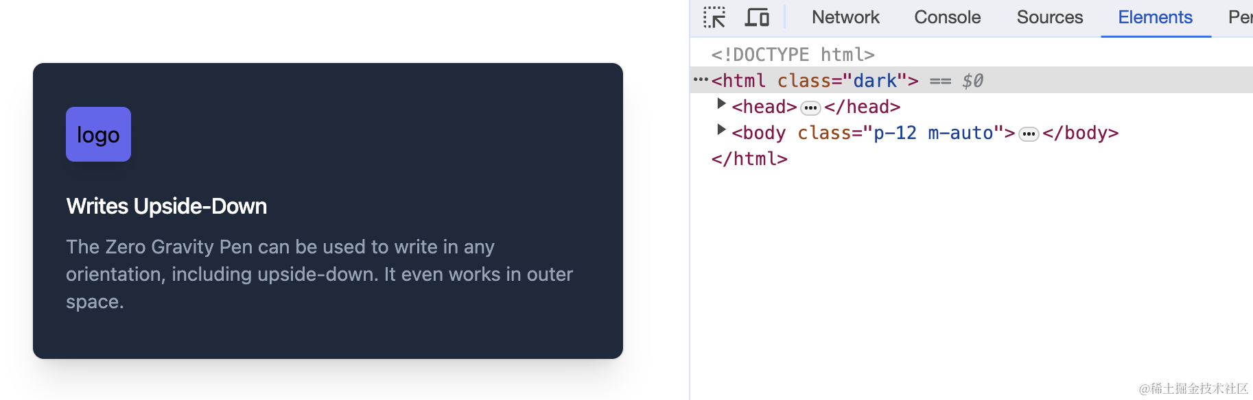
tailwindcss 内置了 dark 夜间模式,可以支持白天和黑夜的切换。比如使用官方的这个例子,使用浏览器 prefers-color-scheme 媒体功能进行变换:
<div class="bg-white dark:bg-slate-800 rounded-lg px-6 py-8 ring-1 ring-slate-900/5 shadow-xl">
  <div>
    <span class="inline-flex items-center justify-center p-2 bg-indigo-500 rounded-md shadow-lg">
      <svg class="h-6 w-6 text-white" xmlns="http://www.w3.org/2000/svg" fill="none" viewBox="0 0 24 24" stroke="currentColor" aria-hidden="true"><!-- ... --></svg>
    </span>
  </div>
  <h3 class="text-slate-900 dark:text-white mt-5 text-base font-medium tracking-tight">Writes Upside-Down</h3>
  <p class="text-slate-500 dark:text-slate-400 mt-2 text-sm">
    The Zero Gravity Pen can be used to write in any orientation, including upside-down. It even works in outer space.
  </p>
</div>
他会自动识别操作系统是否是夜间模式,并应用 dark:后边的属性。
如果想要手动切换夜间模式,可以在配置文件里这样配置:
module.exports = {
  darkMode: 'class', // media 是自动识别
}
此时将 html 设置为夜间模式即可:
<html class="dark">
注意:配置项中使用了 darkMode 后,不能再出现 theme 字段,否则下面的会覆盖上面的配置
你可以使用用户的系统偏好(页面上放置开关控制 localStorage 里 theme 变化)或使用 Window.matchMedia() API 来获取当前操作系统是否为夜间模式:
window.matchMedia('(prefers-color-scheme: dark)').matches
检测到当前为夜间模式时,修改 html 标签的 class,添加 dark 即可。
这里有个问题,就是两种模式每一个文字. 背景都要指定颜色,这个可以提出到公共样式中使用:
.box {
  @apply bg-white text-black;
}

html.dark {
  .box {
    @apply bg-slate-800 text-white;
  }
}
这样在定义类的时候,就会容易一些:
// 白天
<html>
  <div class="box"></box>
</html>

// 夜晚
<html class="dark">
  <div class="box"></box>
</html>
(2. 瀑布流布局
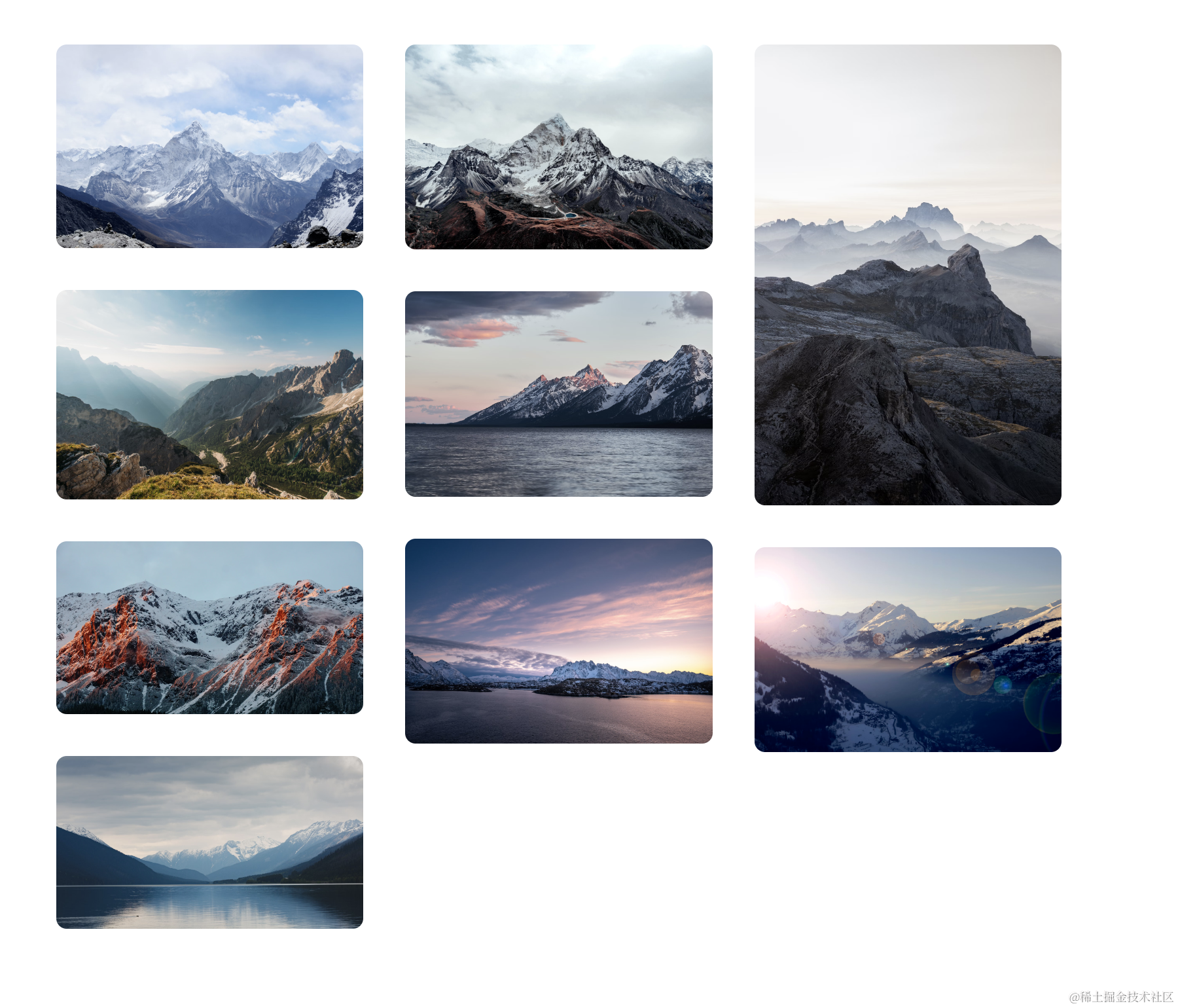
这是官网样例
瀑布流的精髓在于各种不同尺寸的图片能够完美的计算高度并逐次排队。我们假设要显示三列图片,我们就设置一个响应式的列布局盒子容器:
<div class="columns-2 sm:columns-3 gap-8">
此时,样式如下:
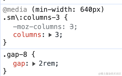
表示在 大于 sm 尺寸下,使用 3列布局,否则使用 2列布局。gap 表示每一列之间的间距,不设置的话默认 16px (继承属性,chrome 是 16px)。
容器内放置一个一个的图片。我们分别使用 div 来包裹图片:
<div class="aspect-w-16 aspect-h-9">
  <img class="w-full object-cover rounded-lg" src="">
</div>
aspect-w-16: 这个类表示设置一个元素的宽度,使其宽度为高度的16倍。aspect-h-9: 这个类表示设置一个元素的高度,使其高度为宽度的9倍。
当然这两个类是已知图片长宽比时可以这么写,不知道的话就不写。.w-full 表示宽度撑满该列,object-cover 元素被缩放以覆盖整个容器框,但可能会被裁剪。
因为是列式布局,是从左开始,从上往下布局的,所以之后的元素都需要加上 margin:
<div class="aspect-w-1 aspect-h-1 mt-8">
然后我们再加上外边框和居中样式美化,全部代码如下:
<body class="p-12 m-auto">
<div class="container flex justify-center">
<div class="columns-2 sm:columns-3 gap-8">
<div>
<img class="w-full object-cover rounded-lg" src="https://images.unsplash.com/photo-1454496522488-7a8e488e8606?ixlib=rb-1.2.1&ixid=MnwxMjA3fDB8MHxwaG90by1wYWdlfHx8fGVufDB8fHx8&auto=format&fit=crop&w=2952&q=80">
</div>
<div class=" aspect-w-1 aspect-h-1 mt-8">
<img class="w-full object-cover rounded-lg" src="https://images.unsplash.com/photo-1434394354979-a235cd36269d?ixlib=rb-1.2.1&ixid=MnwxMjA3fDB8MHxwaG90by1wYWdlfHx8fGVufDB8fHx8&auto=format&fit=crop&w=2902&q=80">
</div>
<div class="aspect-w-1 aspect-h-1 mt-8">
<img class="w-full object-cover rounded-lg" src="https://images.unsplash.com/photo-1491904768633-2b7e3e7fede5?ixlib=rb-1.2.1&ixid=MnwxMjA3fDB8MHxwaG90by1wYWdlfHx8fGVufDB8fHx8&auto=format&fit=crop&w=3131&q=80">
</div>
<div class="sm:block aspect-w-1 aspect-h-1 mt-8">
<img class="w-full object-cover rounded-lg" src="https://images.unsplash.com/photo-1463288889890-a56b2853c40f?ixlib=rb-1.2.1&ixid=MnwxMjA3fDB8MHxwaG90by1wYWdlfHx8fGVufDB8fHx8&auto=format&fit=crop&w=3132&q=80">
</div>
<div class="sm:block aspect-w-16 aspect-h-9 mt-8">
<img class="w-full object-cover rounded-lg" src="https://images.unsplash.com/photo-1611605645802-c21be743c321?ixlib=rb-1.2.1&ixid=MnwxMjA3fDB8MHxwaG90by1wYWdlfHx8fGVufDB8fHx8&auto=format&fit=crop&w=2940&q=80">
</div>
<div class="sm:block aspect-w-1 aspect-h-1 mt-8">
<img class="w-full object-cover rounded-lg" src="https://images.unsplash.com/photo-1498603993951-8a027a8a8f84?ixlib=rb-1.2.1&ixid=MnwxMjA3fDB8MHxwaG90by1wYWdlfHx8fGVufDB8fHx8&auto=format&fit=crop&w=2936&q=80">
</div>
<div class="sm:block aspect-w-1 aspect-h-1 mt-8">
<img class="w-full object-cover rounded-lg" src="https://images.unsplash.com/photo-1526400473556-aac12354f3db?ixlib=rb-1.2.1&ixid=MnwxMjA3fDB8MHxwaG90by1wYWdlfHx8fGVufDB8fHx8&auto=format&fit=crop&w=2940&q=80">
</div>
<div class="sm:block aspect-w-1 aspect-h-1 mt-8">
<img class="w-full object-cover rounded-lg" src="https://images.unsplash.com/photo-1617369120004-4fc70312c5e6?ixlib=rb-1.2.1&ixid=MnwxMjA3fDB8MHxwaG90by1wYWdlfHx8fGVufDB8fHx8&auto=format&fit=crop&w=1587&q=80">
</div>
<div class="sm:block aspect-w-16 aspect-h-9 mt-8">
<img class="w-full object-cover rounded-lg" src="https://images.unsplash.com/photo-1518892096458-a169843d7f7f?ixlib=rb-1.2.1&ixid=MnwxMjA3fDB8MHxwaG90by1wYWdlfHx8fGVufDB8fHx8&auto=format&fit=crop&w=2940&q=80">
</div>
</div>
</div>
</body>
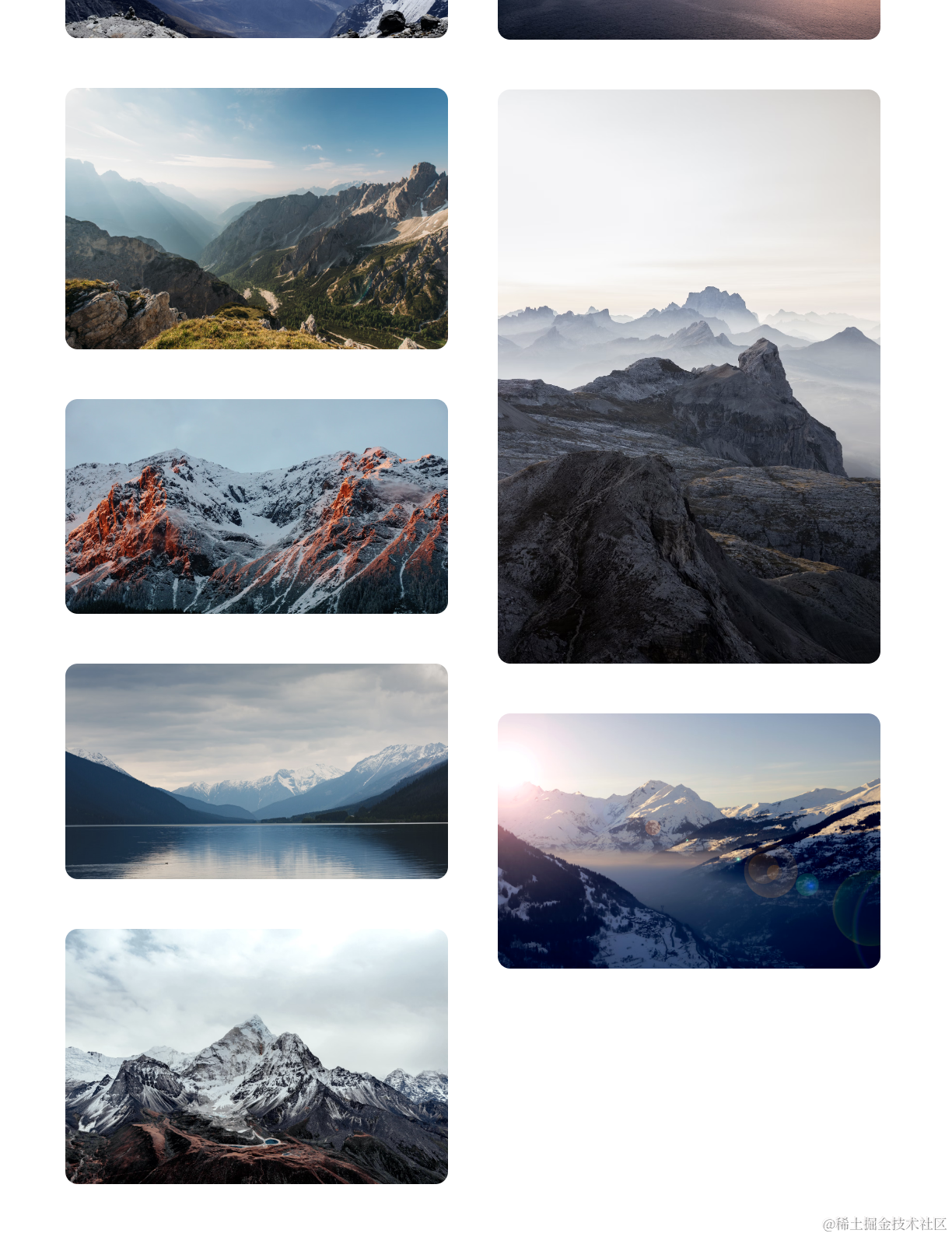
效果图:
大屏:
小屏:
(3. 写一个带动画的组件
tailwindcss 内置了一个小型的动画库,可以使用类来控制。下面的代码是一个弹跳的按钮:
<button type="button" class="animate-bounce bg-indigo-500 text-white p-2 rounded-md">
  Hello World
</button>
效果如下:

大致讲解就这么多啦,债见!